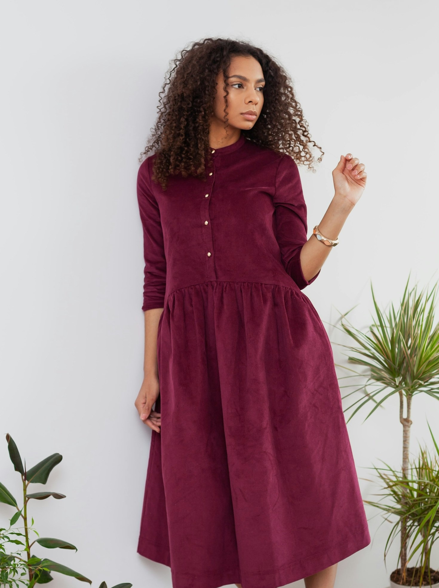
Each season brings a fresh wave of inspiration, and color plays a significant role in setting the tone for fashion, home decor, and design trends. The right color palette can enhance your wardrobe, revamp your living space, or refresh your creative projects. As the seasons change, so do the trending shades, reflecting nature’s transitions and cultural influences. Whether you’re looking for cozy autumn hues, vibrant summer shades, or pastel spring tones, this guide will explore the top color palettes for each season and how to incorporate them into your style.
Spring: Soft Pastels and Nature-Inspired Hues
Spring is synonymous with renewal and freshness, bringing a palette of light, airy, and nature-inspired colors. Soft pastels, muted greens, and floral shades dominate this season, evoking a sense of rebirth and tranquility.
Trending Colors:
- Blush Pink – A delicate, romantic shade that complements both casual and formal styles.
- Mint Green – A refreshing and uplifting hue that pairs well with neutrals.
- Lavender – A soft and elegant shade that adds a touch of sophistication.
- Sky Blue – Light and airy, this color enhances a feeling of openness and calm.
- Butter Yellow – A warm and cheerful shade that brings vibrancy to spring outfits.
How to Use Spring Colors:
- Fashion: Incorporate pastels through flowy dresses, lightweight scarves, and accessories.
- Home Decor: Add soft-colored throw pillows, floral arrangements, and light curtains to create an inviting space.
- Graphic Design: Use pastel gradients for fresh and modern visual appeal.
Summer: Bright, Bold, and Playful Tones
Summer is all about energy, warmth, and adventure. This season’s color palette consists of vibrant, tropical shades that exude confidence and excitement.
Trending Colors:
- Coral Red – A lively shade that reflects passion and joy.
- Sunshine Yellow – A radiant and energizing color perfect for sunny days.
- Turquoise Blue – A cool, refreshing shade reminiscent of ocean waves.
- Tangerine Orange – A zesty hue that adds a fun and playful touch.
- Fuchsia Pink – A bold and eye-catching shade that makes a statement.
How to Use Summer Colors:
- Fashion: Opt for bold prints, swimwear, and accessories in these vibrant hues.
- Home Decor: Incorporate bright-colored cushions, artwork, or outdoor furniture for a lively atmosphere.
- Graphic Design: Use striking color combinations for summer campaigns and branding.
Autumn: Warm, Earthy, and Rustic Shades
Autumn embraces warmth and coziness, with rich, deep hues inspired by falling leaves, golden sunsets, and nature’s transformation. Earthy tones dominate this season, creating an inviting and comforting aesthetic.
Trending Colors:
- Burnt Orange – A warm and nostalgic hue that captures the essence of fall.
- Mustard Yellow – A deep, golden shade that adds richness to any outfit or decor.
- Olive Green – A versatile, earthy tone that pairs well with neutrals and warm hues.
- Rust Red – A warm, vintage-inspired shade that brings depth to any look.
- Deep Plum – A bold, sophisticated color perfect for making a statement.
How to Use Autumn Colors:
- Fashion: Layer up with cozy knitwear, scarves, and boots in these warm tones.
- Home Decor: Introduce rustic-themed decor with wooden accents, warm lighting, and textured fabrics.
- Graphic Design: Utilize earthy tones for branding and seasonal promotions.
Winter: Cool, Elegant, and Timeless Hues
Winter’s color palette is all about sophistication, crispness, and festive warmth. Deep, rich tones and icy hues define this season, creating a balance between elegance and coziness.
Trending Colors:
- Navy Blue – A timeless, deep shade that exudes sophistication.
- Emerald Green – A luxurious and festive shade perfect for winter occasions.
- Wine Red – A bold, dramatic color that adds warmth and richness.
- Charcoal Gray – A sleek and modern alternative to black.
- Frosty White – A crisp, clean shade that enhances a wintery aesthetic.
How to Use Winter Colors:
- Fashion: Opt for structured coats, velvet dresses, and elegant accessories in these shades.
- Home Decor: Add plush blankets, metallic accents, and candle-lit ambiance for a cozy feel.
- Graphic Design: Use sophisticated contrasts with gold or silver highlights for a luxurious touch.
Year-Round Neutral Tones and Classic Combinations
While seasonal colors shift, neutral tones remain timeless. Colors like beige, taupe, ivory, and black serve as versatile foundations that complement any seasonal palette. Additionally, classic combinations such as black-and-white, navy-and-gold, or pastel-and-gray create a balanced and stylish look year-round.
How to Incorporate Neutrals:
- Fashion: Use neutral basics as layering pieces to highlight seasonal trends.
- Home Decor: Combine neutral furniture with pops of seasonal colors.
- Graphic Design: Utilize neutral backgrounds to allow vibrant colors to stand out.
Conclusion
Each season brings its own unique color palette that influences fashion, interior design, and creative projects. Whether you prefer soft pastels in spring, bold and tropical hues in summer, warm earth tones in autumn, or sophisticated icy shades in winter, the right colors can enhance your style and surroundings. By embracing these seasonal trends while incorporating timeless neutrals, you can create a versatile and stylish aesthetic all year round.


Leave a Reply